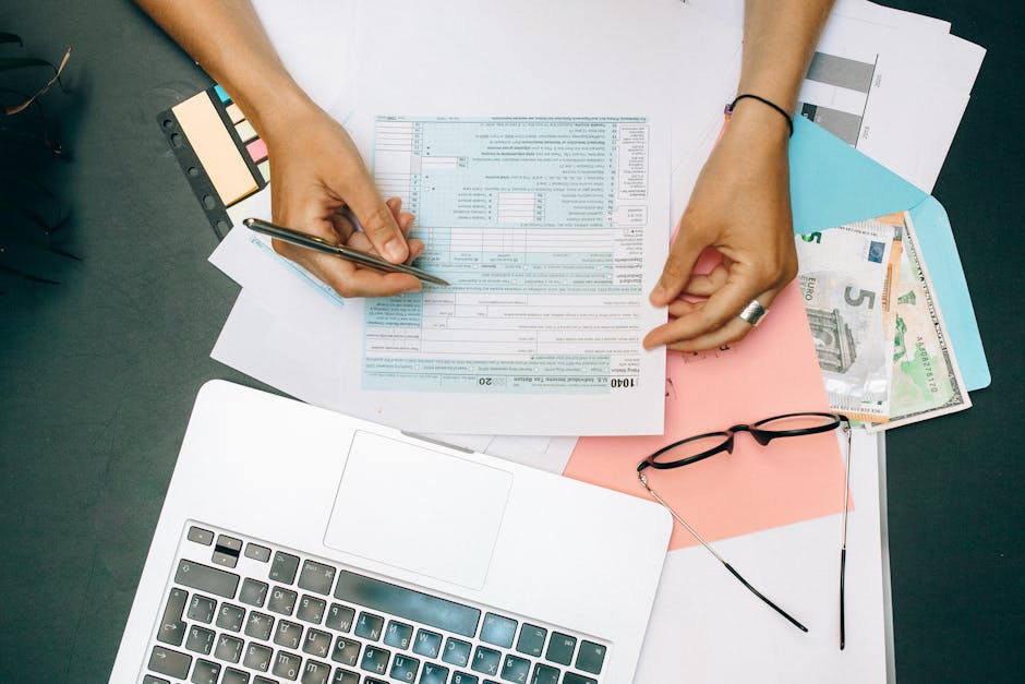
I have a confession: I keep a spreadsheet. It’s not a list of high-performing stocks or calorie counts. It’s a list of every mobile app I’ve downloaded in the last six months and exactly how many seconds it takes from the initial tap to the moment I’m actually "in." If an app takes more than 20 seconds to sign up, it goes on the "do not recommend" list. If the checkout flow feels like a relic from the dial-up era, I’m deleting it before the payment processes.
In the world of mobile app development, we love to throw around the term "frictionless." But how many of us actually mean it? Most teams treat secure payment integration as a necessary burden—a thick, molasses-like layer they have to bolt onto the product. They think security requires a sacrifice of speed. I’m here to tell you that’s a lie. If your users are waiting more than a heartbeat for their payment verification, you aren’t protecting them; you’re just annoying them.
The 5-Second Threshold: Why Fast Checkout Isn't Optional
I spend a lot of time testing mobile sites on intentionally terrible Wi-Fi. I head to the basement, I toggle on airplane mode, I throttle my connection. Why? Because the real world isn't fiber-optic. If your app relies on heavy, unoptimized API calls to verify a credit card, you’re losing customers the second they hit that "Pay" button.
In a mobile-first environment, fast checkout is the baseline for trust. When a user enters their payment information, they expect a seamless transition from intent to confirmation. When that process hangs, the user experiences a cognitive disconnect. They start questioning if the app is frozen, if their money is safe, or if they just got scammed. That anxiety kills conversion rates faster than a bad UI.
The solution is not to reduce security. It’s to move it out of the user’s sightline.
The Pillars of Modern Mobile Payment UX
- Asynchronous Processing: Don't make the UI wait for the server to ping the bank. Use optimistic UI patterns that confirm the "intent" to pay while the encrypted transactions process in the background. Biometric Integration: If you are still asking users to type in a 16-digit card number and a CVV on a tiny glass keyboard, you are failing the UX test. FaceID and TouchID are the gold standards for verification in 2024. Tokenization: Never store raw card data. By using payment tokens, you reduce the scope of your compliance, speed up the transaction, and provide a layer of security that traditional databases simply can't touch.
Smartphone-First Accessibility: Stop Porting Your Desktop Flow
A mobile app is not a shrunk-down website. I’ve audited hundreds of apps that tried to force a desktop checkout flow—all those multi-step forms with "Shipping," "Billing," "Review," and "Finalize"—into a five-inch screen. It is a usability nightmare. Mobile-first accessibility means acknowledging that the thumb is the primary input device, not a mouse cursor.
True mobile-first platforms utilize native UI components. They leverage contactless payments apps the device's keychain for secure credential management. They use progress indicators that actually provide feedback. Nothing makes me rage-quit an app faster than a blank white screen with no spinning wheel or progress bar. If you’re processing a payment, tell the user! Give them a haptic buzz, a subtle animation, or a clear progress bar. Silence is the enemy of engagement.

Real-Time Interaction and Participation
We’ve moved past the era of static "Processing..." screens. The most successful mobile platforms treat payment as a participative experience. This means real-time feedback loops. When a user triggers a payment, the app should be actively communicating what is happening:
Input Validation: Don't wait until they hit "Submit" to tell them the zip code is wrong. Validate field-by-field in real-time. Contextual Prompts: If a payment fails, tell them why in plain language. If it’s a temporary connection issue, don’t blame the user. Visual Confirmation: Use micro-animations to signify a successful handoff. A green checkmark isn't just a UI element; it’s a dopamine hit that solidifies the user's decision to buy.Convenience as a Loyalty Driver
Why do people use Amazon or Uber? It’s not just the inventory; it’s the fact that they’ve effectively eliminated the "cost of time" from the checkout process. Convenience is a massive loyalty driver. When a user knows that buying from you is literally a one-tap process, they don't look elsewhere.
I’ve seen too many apps bury their logout buttons and make their payment flows convoluted, thinking that "trapping" the user will increase retention. It does the opposite. Retention comes from ease. It comes from knowing that when I have two minutes to spare in an elevator, I can complete a purchase without needing to hunt for my wallet or wait for a slow validation server.
Comparison: Traditional Checkout vs. Optimized Mobile Checkout
Feature Traditional Checkout Optimized Mobile-First Checkout Input Method Manual form entry (keyboard heavy) Biometric/Digital Wallet (Apple Pay/Google Pay) Security Stored raw card numbers (high risk) Tokenized vaulting (low risk) UI Feedback Static loading screen Haptic/Progress-based animation Processing Synchronous (wait for bank) Asynchronous (background validation)A Final Word on Transparency
One of my biggest gripes with current "FinTech" marketing is the vague, overhyped language. Every landing page claims "Bank-Level Security" and "Lightning Fast Transactions," but when you look under the hood, the UX is bloated with unnecessary modals and pop-ups. If you want to impress me, don't tell me your encryption is secure—show me by making it invisible. Don't tell me it’s fast—prove it by getting me from cart to confirmation before my coffee gets cold.
Secure payment integration isn't about throwing more hurdles in front of the user to "ensure safety." It's about building an architecture so robust and so well-designed that the user never has to worry about the security at all. The best technology is the kind you don't notice.
Now, if you’ll excuse me, I have to go check my list. There’s an e-commerce app that just forced me to re-enter my address for the third time in a row, and I’m ready to write a very strongly worded column about it.